Gardens Illustrated has Gone Commercial

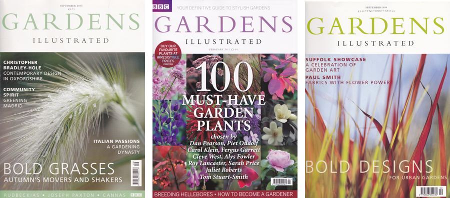
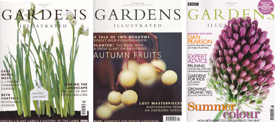
The new cover in the middle, two old quite un-commercial favorites on each side, the one on the right is from before BBC took over.
Gardens Illustrated has Gone Commercial…. But only in comparison to itself.
Gardens Illustrated is another one of my absolute favorite gardening magazines besides Garden Design. Gardens Illustrated started out in gardening a little before me, my first issue seems to be the 1996/1997 December January issue, nr 23. Within a year of reading it I was a subscriber. I took a break at subscribing at some point, actually because I was annoyed at how un-commercial it was at that point. Even though I’m heavily into gardening and I’m getting described as a gardening freak by certain people, I’m also very much a marketer at heart and I really dislike it when I think publications, products and various other things get too self involved and consumer un-friendly. Being a trendsetter and vanguard is one thing, but being too alienated from potentially interested but less involved people I can’t stand. That’s just snobbish.
The decision to call this new February 2011 issue commercial is really all about the cover, it’s loud and it’s the first time GI has had a grid of pictures on its cover. They have as far as I know never before had anything but a single image on their cover. I like the new cover a little, the colors are nice, the single photographs are nice and the content of the headline is interesting. It is more or less a repetition of the issue of Garden Design that I wrote was an all time favorite. That was the “Way Hot 100” cover, which I have to say beats this issue of GI in the looks department.
Some other commercial features seem to have come into the mix since Gardens Illustrated’s earlier days: the mission statement “Your definitive guide to stylish gardens” (gag) and all types of “win this”, “ Buy our”, which I don’t mind that much.
Well, enough about that, I’m really just writing while I warm my toes – it is still -10° C outside. We are not going to experience flowering snowdrops in February this year – so why is Gardens Illustrated torturing me with a wonderful feature on snow drop walks 😉 ??
Pohdintoja Gardens Illustrated lehden uudesta kannesta, lehti on englanniksi joten en viitsi kääntää pohdintojani suomeksi.
Funderingar kring Gardens Illustrated nya pärm, tidningen är på engelska så jag ids inte översätta mina funderingar.

A few times GI has had a transparent field around the title, otherwise it has more or less always been in the same format. The cover in the middle is one of the worst in my opinion. It is hard to tell it is a rowan (Sorbus ‘Joseph Rock’) and though it is a little pretty it is also dreary and extremely un-commercial. I can imagine that the cover of this new issue has a lot of magazine stand appeal, but if that’s what it’s about, then why not do as the fashion magazines and go for a prettier, less loud subscriber’s cover?


5 Comments
JM
GI is one of my favorites too.
Fager Dam
Gillar pärmen med gräs-strået!
HA
Det luddiga eller de rödtoppade?
Scott
GI is probably my favorite in a short list of Garden magazines…and i usually salivate over the cover, but this one leaves me a bit cold. It certainly is attention-grabbing, but one of the things I love about their covers is the understated elegance they usually project. Of course, I still snapped this one up the minute I saw it 🙂
HA
Exactly 🙂 on this cover none of the individual pictures get a chance and you don’t get the beauty you are used to from GI..